- Room & Space Design
- Paint Color Inspiration
Kids’ Room Color Ideas and Inspiration
A child’s room needs to be many things: a play space, a restful haven, a place to learn and grow. Choosing the right paint color is key to creating an atmosphere conducive to all that. Read on for help making that crucial choice, and for a list of excellent hues worth exploring.
Considerations When Choosing Kids’ Room Colors
1. Your Child’s Age and Preferences
For babies and toddlers, soft pastels, gentle neutrals, and calming blues, greens, or pinks tend to work well, helping create a soothing environment.
For preschool and early elementary kids, you might go with brighter, more playful colors like yellows or energetic blues to help stimulate creativity and play.
As kids get older, they may have their own opinions about how their room looks and feels. Paint color is a great way to allow them to express their personality and growing independence.
2. Mood and Function
If you want to create a calming space, consider blues, soft greens, and muted neutrals. For a more energizing and playful vibe, go with brighter colors. To promote focus and creativity, balanced neutrals and pastel shades are great options.
3. Room Size and Lighting
If your child’s room is smaller and/or gets little natural light, consider lighter colors to make the space feel brighter and more open. If the room is larger and/or gets lots of natural light, you can afford to use darker colors, which help make the space feel cozier.
4. Longevity and Adaptability
If you want your paint colors to keep working as your child grows, consider neutrals, soft pastels, and other adaptable shades listed below. These allow you to refresh accents or decor without repainting the room. It’s generally best to steer clear of trendy or overly vibrant colors, which can quickly feel dated.
5. Color Combinations
A great way to add a pop of personality is using a bold color on one wall, while painting the other walls a neutral color. You can also use a bolder color on furniture, moldings, doors, or storage units. It’s usually best to pair a warm color with a cooler color to maintain balance and harmony.
With all this in mind, it’s important to sample a range of colors, to help ensure you achieve the look and feel you want. Here’s how Samplize makes that easy.
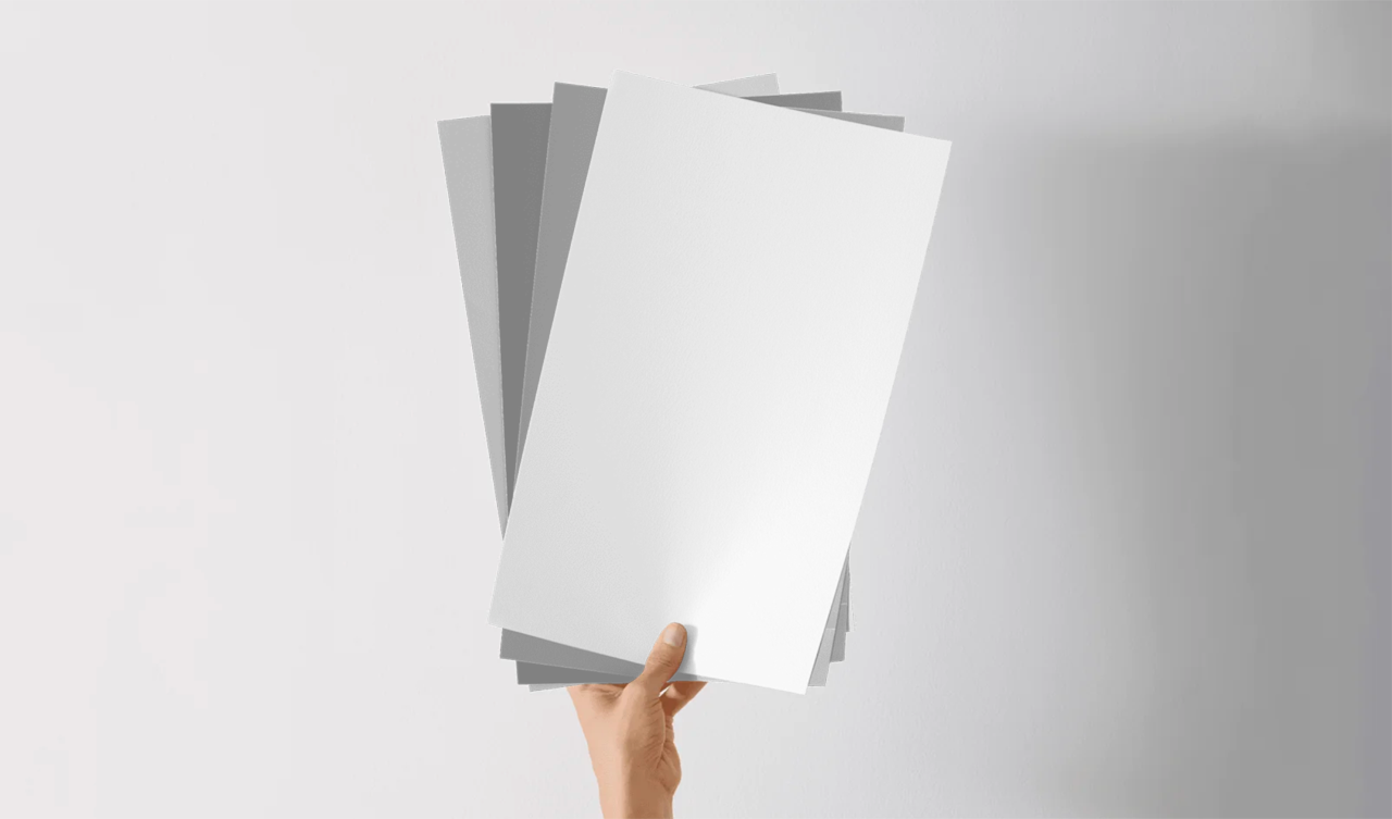
Sampling Colors With Samplize
1. Explore the Possibilities
Start by exploring the colors below, and going here to browse even more colors from leading brands like Benjamin Moore and Sherwin-Williams. Choose a stack of favorites, and your large-format peel-and-stick samples will arrive on your doorstep the very next day.
2. Peel and Stick
Every one of your samples will be painted (not printed) with two coats of real paint, so you’ll be able to really see how each shade actually looks in your child’s room. Make sure to test one sample on an inconspicuous spot first and then feel free to apply them all side by side.
3. Choose With Confidence
Take your time to note how each shade behaves in various conditions. Turn the lights on and off. Close and then open any blinds or curtains. Wait for sunrise, midday, and sunset. Ask friends and family for their favorites. See if your child responds to any of them. If after all that you’ve yet to find your ideal kid’s room color or colors, just repeat these easy steps until you do.
Kids’ Room Colors Worth Sampling
Bright and Bold Hues for Playful Energy
Yellow Highlighter - A light but vivid color that adds cheer without overwhelming.
- yellow-highlighter-2021-40-12x12
Raspberry Blush - A bold and lively coral-pink that works well on an accent wall.
- raspberry-blush-2008-30-12x12
Berry Fizz - A vivid candy-like hue that’s great on furniture or trim.
- berry-fizz-csp-440-12x12
Blue Danube - A saturated blue that balances energy with calming undertones.
- blue-danube-2062-30-12x12
Good Morning Sunshine - A joyful yellow that’s great for energizing playspaces.
- good-morning-sunshine-326-12x12
Coral Reef - A warm and bright pink that’s perfect for adding pops of color on furniture or trim.
- coral-reef-012-12x12
Electric Lime - A bright, almost neon green that makes a big impact in small doses.
- electric-lime-6921-12x12
Exuberant Pink - A cheerful and radiant hue, ideal for play and creativity.
- exuberant-pink-6840-12x12
Soft Pastels That Grow with Your Child
Pale Moon - A gentle off-white with a hint of yellow that works with a variety of decor styles.
- pale-moon-289-12x12
Windmill Wings - A crisp periwinkle that creates a soft and cheerful atmosphere.
- windmill-wings-2067-60-12x12
October Mist - A popular sage-green with muted and soothing energy.
- october-mist-1495-12x12
Quiet Moments - A gentle blue-gray that’s ideal for relaxing reading nooks.
- quiet-moments-1563-12x12
Angelina - A delicate hue that helps create a calming, dreamy vibe.
- angelina-1376-12x12
Misty - A subtle blue with gentle slate undertones that pairs well with a bolder accent color.
- misty-6232-12x12
Lotus Flower - A pale pink that works well as a main color or on trim.
- lotus-flower-6310-12x12
Evergreen Fog - A green-gray that serves as a soothing backdrop.
- evergreen-fog-9130-12x12
Calming Blues and Refreshing Greens
Breath of Fresh Air - A soft, airy blue with a hint of gray, perfect for creating a peaceful and open atmosphere.
- breath-of-fresh-air-806-12x12
Tranquil Blue - An ocean-inspired hue with just a touch of green that adds a restful vibe.
- tranquil-blue-2051-50-12x12
Palladian Blue - A classic blue-green that works beautifully with organic textures.
- palladian-blue-hc-144-12x12
Rainwashed - A calming blend of green, blue, and gray that makes the space feel airy and calm.
- rainwashed-6211-12x12
Sea Salt - A popular green with blue-gray undertones that adds a soft and organic vibe.
- sea-salt-6204-12x12
Pretty Pinks and Cheerful Yellows
Pretty in Pink - A warm, mid-tone hue that’s cheerful without being too candy-like.
- pretty-in-pink-1334-12x12
Nursery Pink - A delicate color that works especially well for a nursery or toddler’s room.
- nursery-pink-2076-70-12x12
Newborn Pink - A playful pastel pink that’s perfect for furniture and a subtle accent wall.
- newborn-pink-2078-60-12x12
Baby Pink - A crisp hue that’s great as a backdrop for patterns or bolder accents.
- baby-pink-2085-70-12x12
Ballet Slippers - A graceful rosy pink that matches well with warm woods and white trim.
- ballet-slippers-1331-12x12
Cheerful - A sunny yellow that creates a sense of play and creativity.
- cheerful-6903-12x12
Childlike - An fun and energetic pink that does wonders in small doses.
- childlike-6569-12x12
Friendly Yellow - A warm and gentle yellow that adds cheer without being too bright.
- friendly-yellow-6680-12x12
Neutrals, Grays, and Greiges That Adapt
Revere Pewter - A classic greige that’s perfect for a calming look that grows with your child.
- revere-pewter-hc-172-12x12
Edgecomb Gray - A softer greige that plays well with a wide range of accent colors.
- edgecomb-gray-hc-173-12x12
Classic Gray - A light greige that creates a bright but grounded atmosphere.
- classic-gray-1548-12x12
Balboa Mist - A versatile greige that adds warmth while helping accent colors pop.
- balboa-mist-1549-12x12
Pale Oak - An organic greige that serves as a perfect base as your child’s decor changes.
- pale-oak-oc-20-12x12
Agreeable Gray - An extremely popular greige that works with both warmer and cooler decor.
- agreeable-gray-7029-12x12
Repose Gray - A muted gray with a subtle warmth that’s ideal for a more modern look.
- repose-gray-7015-12x12
Accessible Beige - A flexible, modern hue that adds warmth without looking overwhelming.
- accessible-beige-7036-12x12