- Paint Color Inspiration
- Room & Space Design
Home Office Paint Colors to Boost Productivity
Anyone who’s worked in a poorly-designed office knows that environment impacts productivity. One of the great advantages of having a home office is that you can design the space to be truly conducive to focus, creativity, and getting work done. Choosing the right paint color is vital to achieving that goal, so read on for tips and ideas for boosting your productivity at home.
6 Key Considerations
Choosing the best paint color for office walls involves balancing personal preference with factors that can positively impact focus, mood, and productivity. Here are key steps to guide your decision:
1. Consider the Purpose of Your Office
Think about the type of work you do. For detail-oriented tasks requiring focus, calming and muted colors like soft blues, warm grays, and greens can foster concentration. Creative fields, on the other hand, might benefit from more invigorating tones like yellows or muted oranges to stimulate energy and inspiration.
2. Evaluate Natural Light
The amount of natural light in your office affects how colors appear on the walls. Rooms with plenty of sunlight can support cooler colors without feeling too stark, while darker spaces might benefit from warm, light-reflecting tones like creams or light taupes to keep the room feeling open and welcoming.
3. Choose the Right Sheen
Sheen impacts both appearance and functionality. Matte and eggshell finishes work well in low-traffic areas where a soft, non-reflective surface is desired, while satin or semi-gloss finishes are easy to clean and can add a hint of reflectivity that makes rooms feel brighter.
4. Match Decor and Furniture
Harmonizing wall color with furniture, art, and decor is essential for achieving a cohesive atmosphere. If your office decor has bold, rich colors, you might choose a neutral wall color to balance the space. If your decor is minimal, you could opt for an accent wall in a strong color to create visual interest without overwhelming the space.
5. Think About Mood
Colors impact how a room feels. Blue is known for its calming effect and ability to aid concentration, while green can boost creativity and focus. Warmer tones like yellow or peach are energizing, ideal for offices with low natural light, or for those seeking a cheerful ambiance.
6. Test Paint Colors
This is the most important step. Testing paint colors is the only way to know for sure how each will impact your home office. Read on for the best way to do just that.
Testing Paint Colors With Samplize
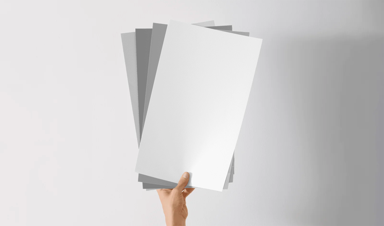
Our large-format peel-and-stick paint samples make sampling paint mess free and stress free. Here’s how it works.
Step One: Choose Your Samples
Enjoy browsing our huge selection of paint colors from leading brands, including Benjamin Moore, Sherwin-Williams, and Farrow & Ball. You can go with our bundles, or handpick a stack of samples in just a few minutes. Finish your order, and your samples will arrive on your doorstep the next day.
Step Two: Peel and Stick
Your samples will be painted (not printed) with two coats of real paint. Start by testing one sample in an inconspicuous spot that’s clean and free of debris. Once you’ve tried one sample, feel free to stick on various colors side by side.
Step Three: Dream, Debate, Decide
Take your time, here. Observe the colors from various spots in your home office. Turn the lights on and off, draw the curtains, wait for the sun to set. If you don’t fall in love with a color, just repeat steps one and two until you find the perfect color for your home office.
20 Great Paint Colors for Home Office Productivity
When you’re ready to start testing colors, here are some great options to consider.
1. Palladian Blue - A calming, soft blue-green that promotes focus and relaxation.
- palladian-blue-hc-144-12x12
2. Revere Pewter - A warm gray that provides a neutral, comforting background.
- revere-pewter-hc-172-12x12
3. Silver Half Dollar - A cool, light gray that’s subtle and calming, reducing eye strain.
- silver-half-dollar-2121-40-12x12
4. White Dove - A soft, warm white that brightens the space without feeling sterile.
- white-dove-oc-17-12x12
5. Coventry Gray - A sophisticated, neutral gray that enhances focus.
- coventry-gray-hc-169-12x12
6. Simply White - A clean white with a slight warmth, offering an uplifting, bright workspace.
- simply-white-2143-70-12x12
7. Edgecomb Gray - A soft, greige that provides warmth and neutrality for concentration.
- edgecomb-gray-hc-173-12x12
8. Blue Echo - A muted teal-blue, promoting calm and clarity.
- blue-echo-af-505-12x12
9. Nimbus - A light, airy gray that’s elegant and calming.
- nimbus-1465-12x12
10. Kendall Charcoal - A rich, deep gray that adds a touch of sophistication without distraction.
- kendall-charcoal-hc-166-12x12
11. Agreeable Gray - A warm, inviting gray that balances comfort and focus.
- agreeable-gray-7029-12x12
12. Sea Salt - A soft, muted green-blue that’s soothing and conducive to calm concentration.
- sea-salt-6204-12x12
13. Accessible Beige - A warm beige that’s light and comforting for long work hours.
- accessible-beige-7036-12x12
14. Evergreen Fog - A muted sage green, ideal for a grounded and calm workspace.
- evergreen-fog-9130-12x12
15. Naval - A deep, rich navy that’s grounding and encourages productivity.
- naval-6244-12x12
16. Alabaster - A warm white that creates a fresh, bright office without glare.
- alabaster-7008-12x12
17. Mindful Gray - A versatile gray with a warm undertone, promoting a balanced, distraction-free space.
- mindful-gray-7016-12x12
18. Peppercorn - A dark gray that’s sophisticated and adds depth, great for accent walls.
- peppercorn-7674-12x12
19. Anew Gray - A slightly warm gray that’s neutral and versatile, adding subtle focus.
- anew-gray-7030-12x12
20. Rock Candy - A cool, light gray that’s almost white, bringing a sense of calm brightness.
- rock-candy-6231-12x12
Note: The Impact of Sheen
The sheen of paint significantly influences both the look and functionality of your home office. Each sheen type has unique qualities that can either enhance or detract from a productive workspace.
Matte and Flat Finishes: Matte or flat sheens create a soft, non-reflective finish that minimizes distractions. They work well in offices that don’t need frequent cleaning, as they are less durable when it comes to scuff and stain resistance. These sheens are excellent for creating a calm, distraction-free environment.
Eggshell and Satin Finishes: Slightly more durable than matte, eggshell and satin sheens offer a hint of sheen that reflects minimal light, helping the walls feel brighter without being overly reflective. These finishes are also easier to clean, making them a good choice for an office that might see some wear over time or is used by multiple family members.
Semi-Gloss: This higher sheen is known for its durability and ease of cleaning, so it’s ideal for high-traffic areas or home offices where wall cleanliness is a priority. While semi-gloss has a reflective quality, it also adds a touch of sophistication and polish. However, if there’s too much direct light in the room, semi-gloss could create unwanted glare that could be distracting.
Gloss and High-Gloss: Gloss and high-gloss finishes are the most reflective and durable. While less common for entire walls, they can be an eye-catching choice for accent walls, cabinetry, or trim. In home offices, high-gloss finishes are useful for highlighting architectural details, though their reflectiveness may be distracting if applied to larger wall surfaces.
Choosing the right sheen depends on the specific needs of the home office—whether it's durability, low reflectivity, or ease of maintenance. By carefully selecting sheens, you can create a space that’s visually comfortable and functionally suited to your needs.
Ready to Find Your Color?
Samplize has thousands of colors to choose from, empowering you to create your ideal workspace. Start your search here.