- Paint Color Inspiration
How To Use Earthy Paint Colors In Your Home
Earthy paint colors can bring a sense of warmth, balance, and harmony to any space. Inspired by natural elements (from soil and rocks to sand and wood), these colors evoke a sense of calm and connection to the earth.
Earth tones are popular in interior design because they help create versatile and timeless looks. They pair well with a range of bold and neutral colors, and work beautifully in combination with natural materials. What’s more, earth tones tend to age gracefully, helping maintain a stylish and cohesive look for years to come.
Read on for tips and inspiration for using earth paint colors in your home.
Are Earthy Colors Warm or Cool?
Earthy colors are generally warm, though some do lean cooler, depending on their undertones. Colors like terracotta, ochre, clay, and mustard add a sense of coziness and warmth, while cooler shades like muted greens and slate grays add a soothing and subtle grounding.
Considerations When Choosing an Earthy Paint Color
- Consider the room’s purpose. Deeper earth tones help create intimacy in living rooms and bedrooms, while lighter neutrals make smaller spaces feel open and airy.
- Think about the undertone. This is an effective way to marry different colors. Aim to match undertones across walls, trim, and accents to keep your palette cohesive.
- Pay attention to lighting, which plays a big role in how a color actually looks in a space. Warm, natural light enhances golden and clay tones, while cooler light can make greens or grays look more subdued.
As you use these criteria to narrow down your options, it’s important to sample paint colors to see how each performs in your space. Luckily, Samplize makes that step simple.
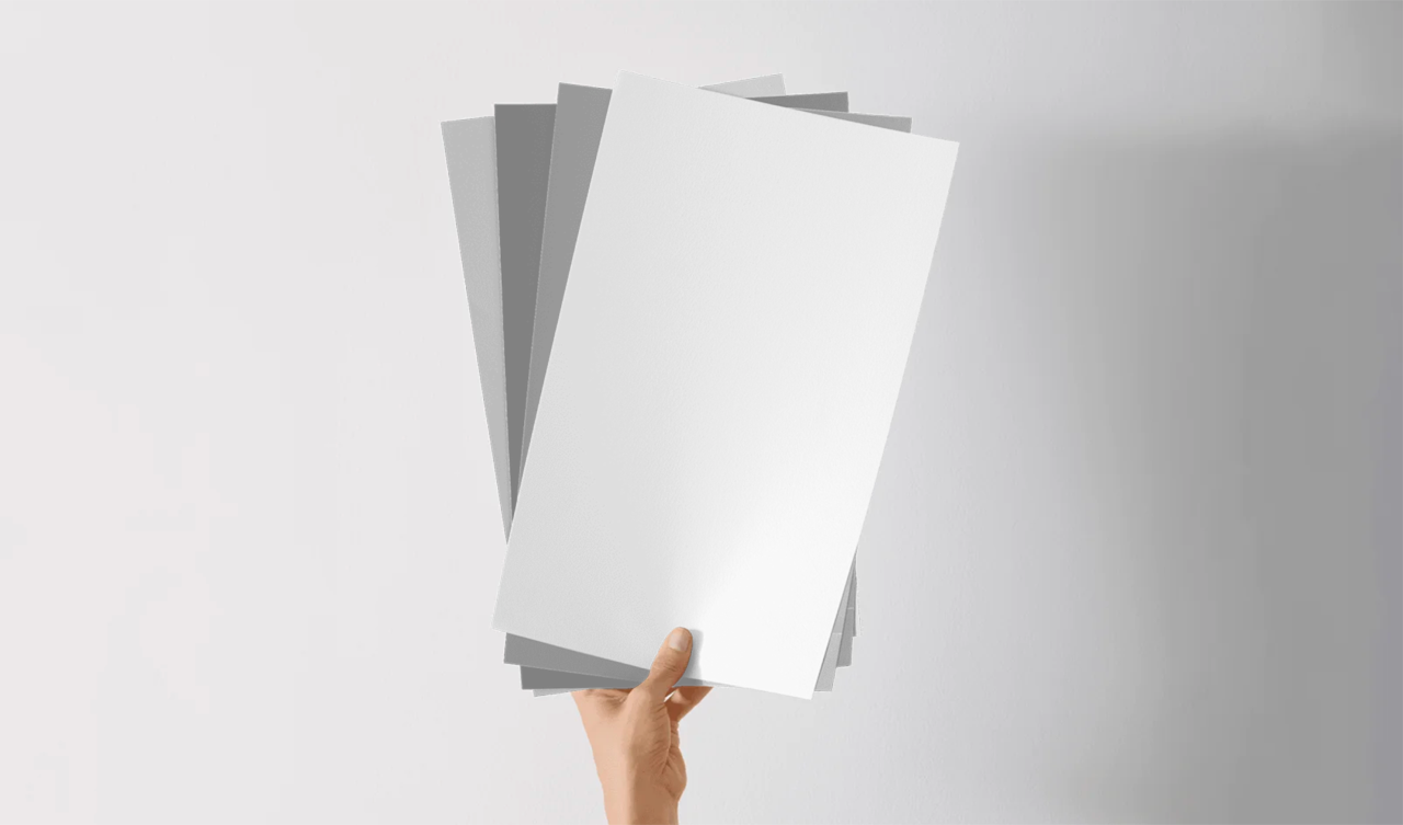
Sampling Colors With Samplize
Our large-format, mess-free, peel-and-stick paint samples make it easy to find your ideal earthy paint color. Here’s how it works.
1. Explore the Possibilities
Start by going here and browsing our huge collection of colors from leading brands like Benjamin Moore and Sherwin-Williams. Place your order, and your large-format peel-and-stick samples will arrive on your doorstep the very next day.
2. Peel and Stick
Every one of your samples will be painted (not printed) with two coats of real paint, so you’ll be able to really see how each earthy shade really looks in your space. Make sure to test one sample on an inconspicuous spot first and then feel free to apply them all side by side.
3. Choose With Confidence
Take your time to note how each shade behaves in various conditions. Turn the lights on and off. Close and then open any blinds or curtains. Wait for sunrise, midday, and sunset. Gather second and even third opinions, and if after all that you’ve yet to find your perfect earthy paint color, just repeat these easy steps until you do.
10 Earthy Paint Colors Worth Sampling
1. Earth Brown – A rich, soil-inspired hue that adds depth and grounding to any space.
- earth-brown-2102-10-12x12
2. Warm Earth – A warm neutral with soft berry undertones for a cozy and sophisticated vibe.
- warm-earth-1274-12x12
3. Green Earth – A muted, natural green that evokes a grounded calm.
- green-earth-7748-12x12
4. Rural Earth – A deep brown with just a hint of shadow that’s perfect for moody accent walls.
- rural-earth-1239-12x12
5. Earthly Russet – A warm brown with red-orange undertones, ideal for creating an inviting and lively vibe.
- earthly-russet-2173-10-12x12
6. Accessible Beige – A versatile, warm-neutral greige that’s great as a base for layered palettes.
- accessible-beige-7036-12x12
7. Cavern Clay – A terracotta-inspired hue that adds a cozy, desert-like glow.
- cavern-clay-7701-12x12
8. Tamarind – Deep reddish-brown that’s rich and grounding—perfect for statement walls.
- tamarind-af-120-12x12
9. Wheat Penny – A coppery golden brown that adds subtle warmth and a touch of character.
- wheat-penny-7705-12x12
10. Universal Khaki – A warm khaki-beige that’s timeless, grounding, and remarkably versatile.
- universal-khaki-6150-12x12
Combining Earth Tones With Other Colors
This is a great way to add depth, contrast, and visual interest to your home while keeping the feel natural and harmonious.
- Combine an earthy neutral with a white, cream, or soft gray for a subtle, layered look.
- Accentuate a warmer earth tone with a deep blue, green, or muted red to create a rich and inviting atmosphere.
- Pair a cooler earth tone with a soft blue or dusty pink to create a calming palette.
Complement these pairings with organic textures like wood, stone, and natural fabrics to enhance a soothing natural aesthetic.
Of course, it’s vital to sample various color pairings to make sure you achieve the look and feel you want.
Tips for Creating Balance With Earthy Paint Colors
1. Distribute Color Evenly – Spread your dominant, secondary, and accent colors throughout the space so that no one area feels too heavy. For example, if you have a warm terracotta wall, balance it with neutral furnishings or cooler accents.
2. Consider Undertones – Make sure the undertones of your colors complement each other. Warm earth tones pair best with other warm shades or neutrals, while cooler earth tones harmonize well with cooler blues, grays, or greens.
3. Soften With Neutrals – Whites, creams, and grays provide visual breathing room between stronger colors, helping your palette feel inviting, not overwhelming.
4. Vary Texture and Material – Balance color intensity with natural textures to add depth and keep the space from feeling flat.
5. Pay Attention to Proportion – Use dominant colors on large surfaces, secondary colors on furniture or cabinetry, and accent colors in smaller details like pillows or framed art.
Ready to Begin?
Earthy colors can do wonders for any space, so long as you find the perfect hue for you. Explore the wide range of possibilities and find your ideal color here.